I’ve struggled with Liquid Glass since its introduction. At first, I embraced it, but clearly it was not designed with Mac in mind, so I used accessibility settings to “turn off” Liquid Glass, but clearly macOS is not designed to thoughtfully remove UX concepts. So, finally, I went back to first principles.
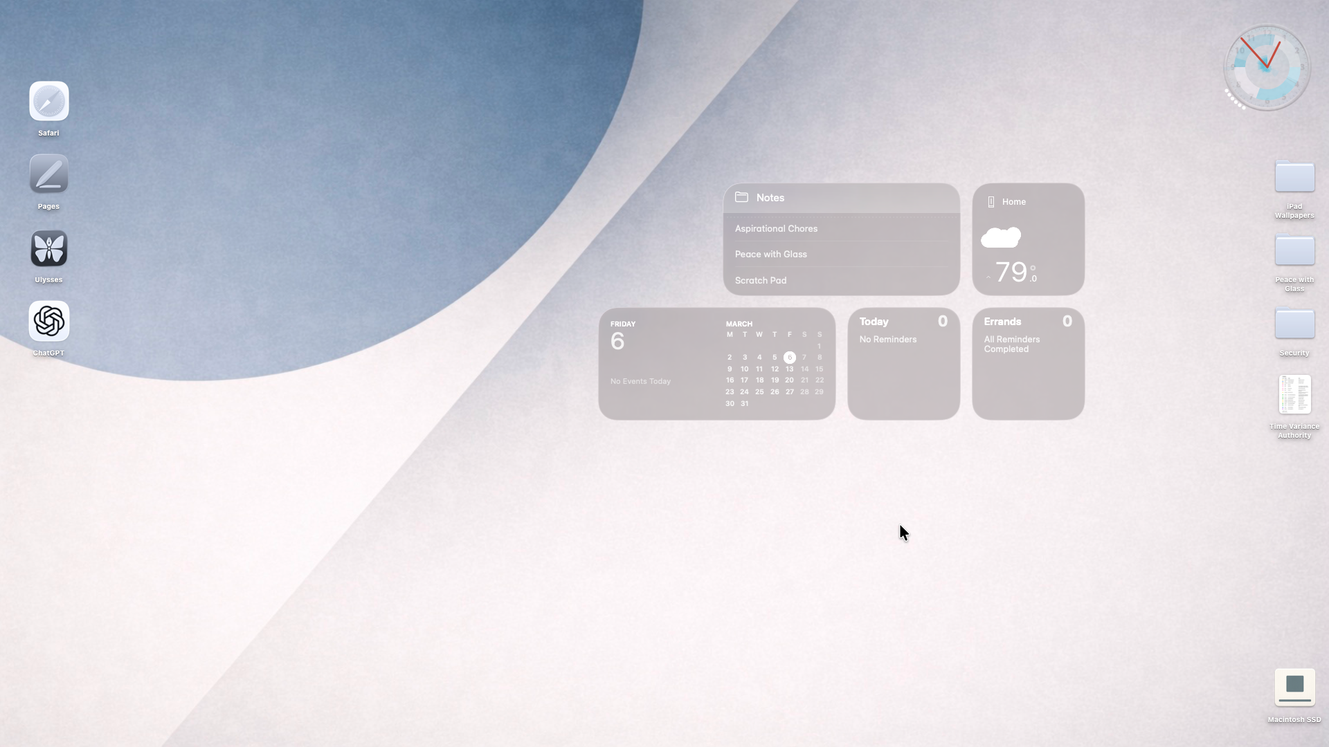
My Mac desktop works best as a calm workbench rather than a dashboard. The left edge holds stable anchors and frequently used tools that rely on spatial memory, while the top-right column is reserved for incoming files so Finder’s natural placement behavior supports file triage. The center remains mostly empty to preserve clarity and allow temporary grouping of work items. Only persistent instruments that genuinely influence behavior are allowed on the surface; unused informational elements are removed. When the desktop fades into the background and simply supports seeing, sorting, and moving files, the design is doing its job.
- Aliases are used on the left as app icons. I am still deciding what apps belong there.
- The Dock is deprecated to app task monitor, hidden at the bottom, it shows only active apps.
- Complimentary to the hidden Dock is the hidden Menu Bar because it looks like ass with glass. I prefer keyboard commands, anyway.
- The widgets on the right probationary. I need a constant reminder of the future, lest I lose myself in the present.
- The clock is iPulse, a system monitor for the Mac that I have been using for literally decades.
* The “hard drive” is on the bottom right because that is where I got used to it being—not the top right—decades ago.
- The background and Macintosh SSD icon are a result of a conversation with ChatGPT. Not much overlap in the Venn diagram between Bauhaus and Zen. At the end of the discussion, I asked it to create some “Bauhausesque” wallpapers and Mac icons. I chose these.
- Regarding Appearance settings, I set appearance to always Light, Liquid Glass to clear, multicolor theming, clear icon and widget style.
* Regarding Accessibility settings, I set Reduce transparency OFF, Differentiate without color ON, Show window title icons ON, Show toolbar button shapes ON, Menu bar size LARGE
As to why “turning off” Liquid Glass through accessibility settings does not work, it’s part of how the interface communicates depth and separation. Everything is designed with transparency in mind: layout, spacing, colors, shadows, everything, so the system still expects those cues, and without a graceful deprecation mode the UI feels…off.
For me, this is what peace looks like.